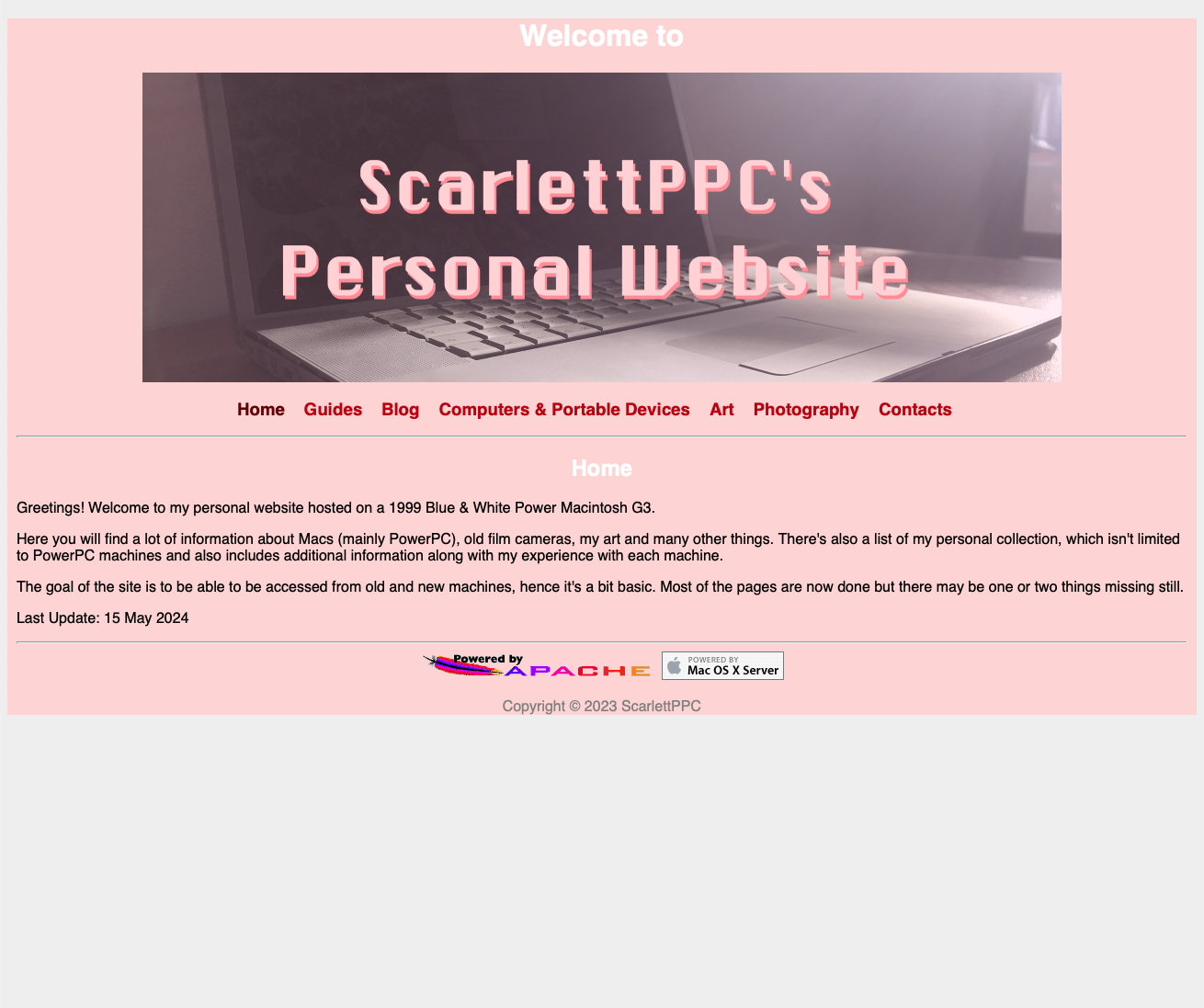
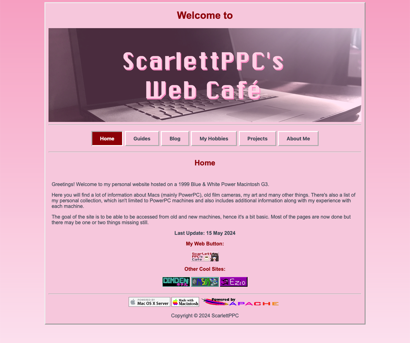
As you may have noticed I redesigned my site! While the old one was functional and looked alright, I felt it was lacking and that I could do more than that. Also I didn't like how some stuff was structured so I decided to just start from scratch and just took the index page from the last one and built everything else from it.
Some changes between the old and new site:
Since everything is in HTML and CSS, the old site looks bad on big screens so I decided to make the content a fixed size, so it stays more properly in the center.


I also revamped the index page and added web buttons to other people's sites (cause buttons are cool). I also thought it was the perfect time to make my own button! You can see it on the index page or the "Art".
Speaking of that, I changed the layout a bit, now my hobbies are... well, under the "My Hobbies" page. I wanted to keep the main navigation bar clean and since I have a lot of hobbies (with the very probable possibility of more popping up in the future) and having a different hyperlink for each would make the navbar way too long.
I also made the contacts page into the "About Me" page cause I wanted to talk a bit about myself, you know, the person that made this site and not be some mysterious figure behind this (lol). The contact links are still there and I even added more so you can find me on more places.
I also made small design improvements all around the site to make it feel cleaner and nicer to look at.
Hopefully, the results are good! Also I'm open for criticism or suggestions, just use one of the social links and reach me on there!


